
Seaborn Data Visualization
When it comes to data visualization in Python, Matplotlib is powerful but often requires extra effort to make plots look polished. Seaborn, built on top of Matplotlib, simplifies this process by providing a high-level interface for drawing attractive and informative statistical graphics.
It integrates well with Pandas data structures, making it easy to visualize data directly from DataFrames without needing to manually extract columns.
In this post, we’ll explore how to get started with Seaborn, create great-looking visualizations with minimal effort.
Import required libraries.
import pandas as pd
import matplotlib.pyplot as plt
import seaborn as sns
We will use iris dataset to create plots.
df = sns.load_dataset('iris')
df.head()
| sepal_length | sepal_width | petal_length | petal_width | species | |
|---|---|---|---|---|---|
| 0 | 5.1 | 3.5 | 1.4 | 0.2 | setosa |
| 1 | 4.9 | 3.0 | 1.4 | 0.2 | setosa |
| 2 | 4.7 | 3.2 | 1.3 | 0.2 | setosa |
| 3 | 4.6 | 3.1 | 1.5 | 0.2 | setosa |
| 4 | 5.0 | 3.6 | 1.4 | 0.2 | setosa |
Set seaborn style theme
Parameters: Seaborn link
- context: changes label size, line thickness, etc
options: ‘paper’, ‘notebook’, ‘talk’, ‘poster’ - style: changes plot styles
options: ‘darkgrid’, ‘whitegrid’, ‘dark’, ‘white’, ‘ticks’ - palette: Choose color palette, see color palettes section for detail options: ‘deep’, ‘muted’, ‘bright’, ‘pastel’, ‘dark’, ‘colorblind’
- rc: Dictionary of rc parameter mappings to override
# default
sns.set_theme()
sns.set_theme(context='notebook', style='darkgrid', palette='deep', font='sans-serif', font_scale=1, color_codes=True, rc=None)

# custom example
custom_params = {"axes.spines.right": False, "axes.spines.top": False}
sns.set_theme(context='paper', style='darkgrid', palette='Pastel1', font='century gothic', rc=custom_params)
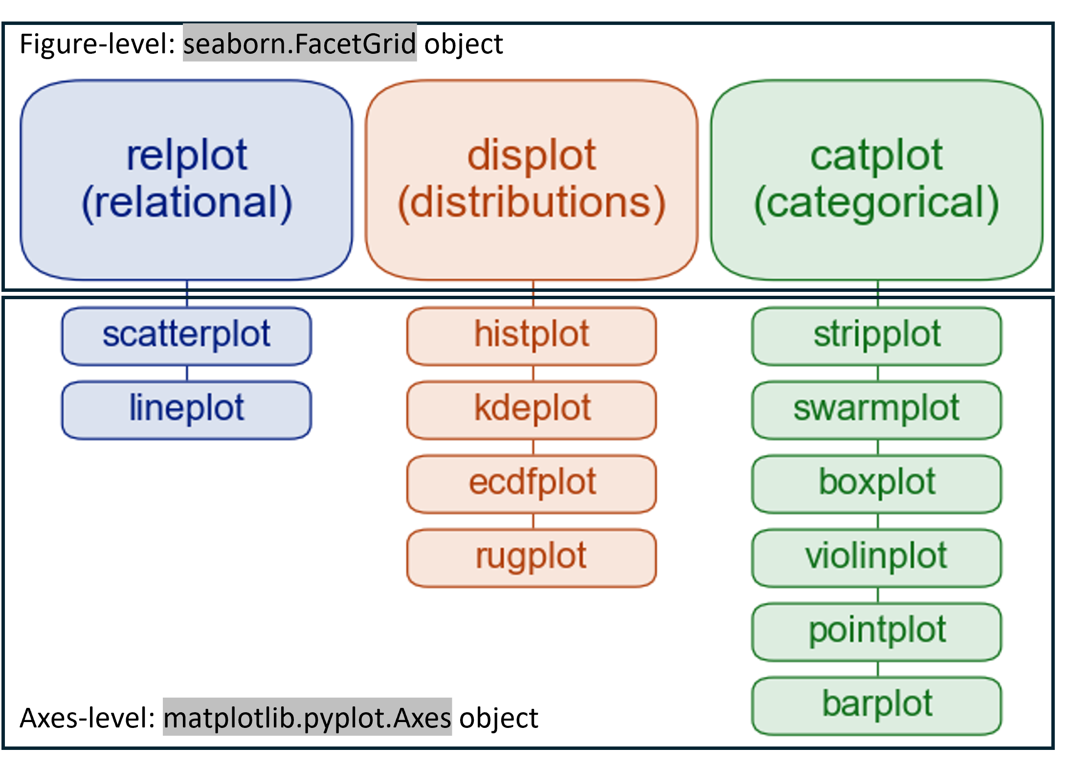
Axes-level
Seaborn has two ways of functions to plot. Figure-level function generates seaborn.FacetGrid object and Axes-level function generate matplotlib.pyplot.Axes object.
For better control, it is better to use Axes-level functions.
List plots
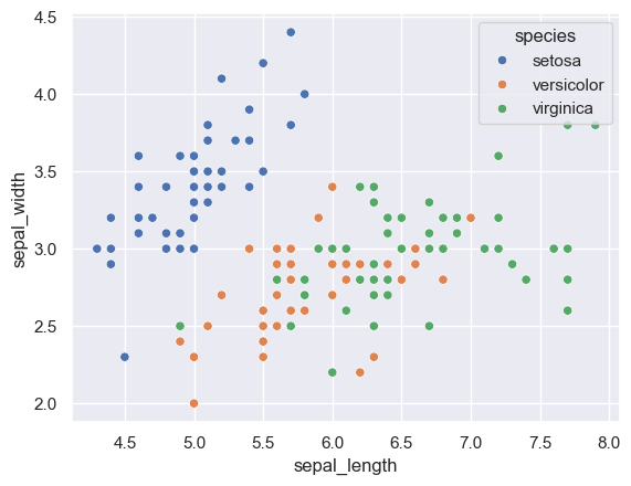
# scatterplot
sns.scatterplot(data=df, x='sepal_length', y='sepal_width', hue='species')
plt.show()
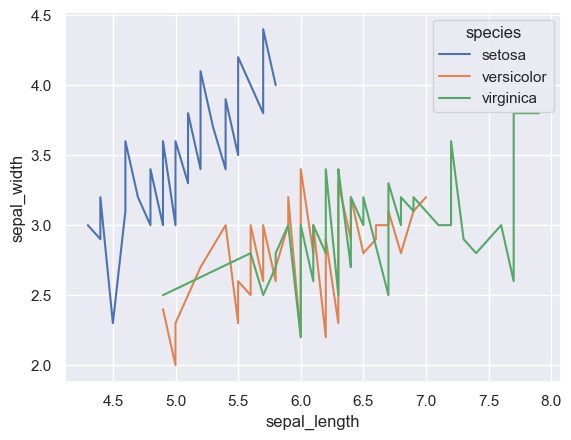
# lineplot
sns.lineplot(data=df, x='sepal_length', y='sepal_width', hue='species', estimator=None)
plt.show()
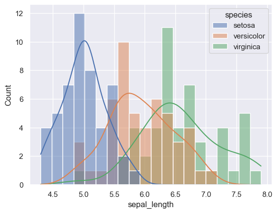
Histogram
# histplot
sns.histplot(data=df, x='sepal_length', hue='species', stat='count', bins=20, kde=True)
plt.show()
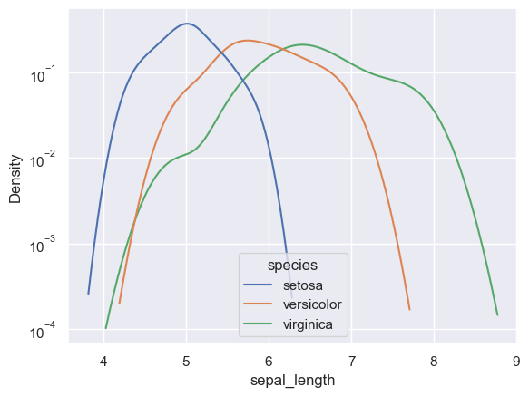
# kdeplot
sns.kdeplot(data=df, x='sepal_length', hue='species', log_scale=(False,True))
plt.show()
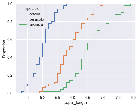
# ecdfplot
sns.ecdfplot(data=df, x='sepal_length', hue='species')
plt.show()
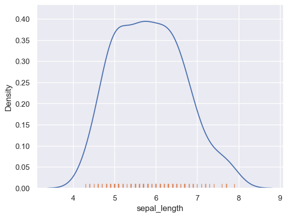
# rugplot
sns.kdeplot(data=df, x='sepal_length')
sns.rugplot(data=df, x='sepal_length')
plt.show()
Categorical plot
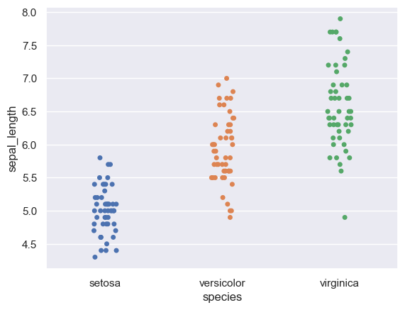
# stripplot
sns.stripplot(data=df, x='species', y='sepal_length', hue='species')
plt.show()
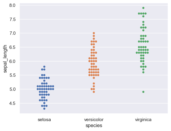
# swarmplot
sns.swarmplot(data=df, x='species', y='sepal_length', hue='species')
plt.show()
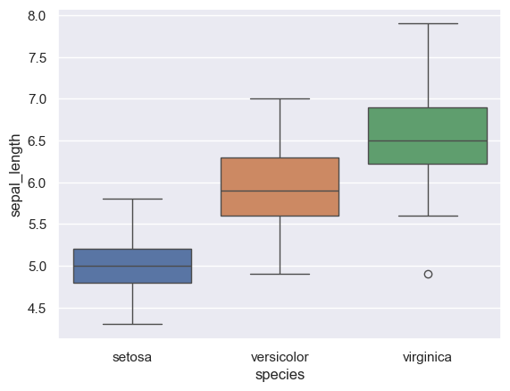
# boxplot
sns.boxplot(data=df, x='species', y='sepal_length', hue='species')
plt.show()
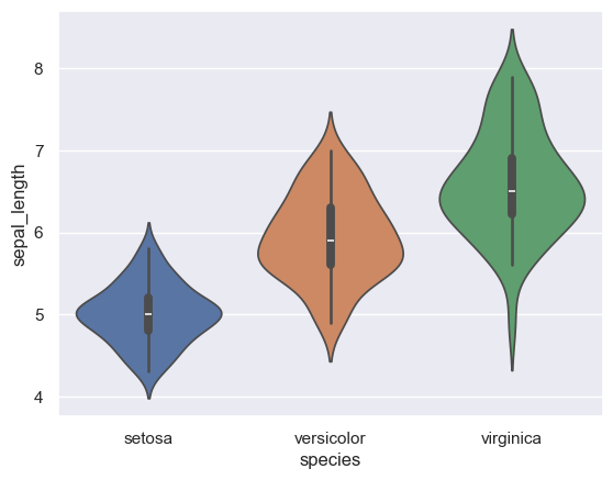
# violinplot
sns.violinplot(data=df, x='species', y='sepal_length', hue='species')
plt.show()
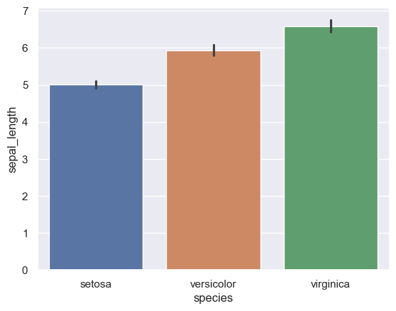
# barplot
sns.barplot(data=df, x='species', y='sepal_length', hue='species')
plt.show()
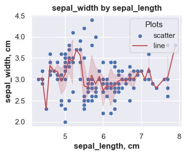
Multiple plots in one axes
# create a single grid figure using plt.subplots - default size (width, height) is 6.4 and 4.8 inches
fig, ax = plt.subplots(figsize=(4,3))

# add sns plots to the axes
sns.scatterplot(data=df, x='sepal_length', y='sepal_width', ax=ax, label='to be override')
sns.lineplot(data=df, x='sepal_length', y='sepal_width', color='r', ax=ax, label='to be override')

# add title, legend and label - will override sns plot parameters
ax.set_title('sepal_width by sepal_length', {'fontsize': 12, 'fontweight':'bold'})
ax.legend(title="Plots", labels=['scatter','line'])
ax.set_xlabel('sepal_length, cm', {'fontweight':'bold'})
ax.set_ylabel('sepal_width, cm', {'fontweight':'bold'})
# ax.set(xlabel='sepal_length, cm', ylabel='sepal_width, cm')

plt.show()
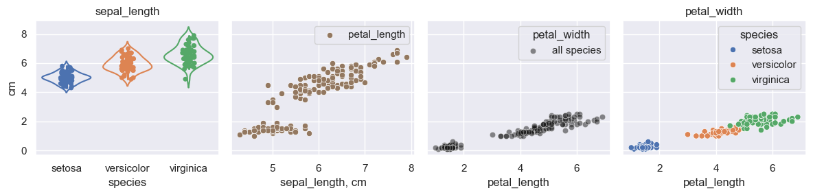
Multiple plot in a figure
# create a grid using plt.subplots - default size (width, height) is 6.4 and 4.8 inches
fig, ax = plt.subplots(1,4,figsize=(12,3), sharey=True)

# first plot
sns.stripplot(ax=ax[0], data=df, x='species', y='sepal_length', hue='species')
sns.violinplot(ax=ax[0], data=df, x='species', y='sepal_length', hue='species', fill=False)
ax[0].set(ylabel='cm')
ax[0].set_title('sepal_length')

# second plot
sns.scatterplot(ax=ax[1], data=df, x='sepal_length', y='petal_length', color=sns.color_palette()[5])
ax[1].legend(labels=['petal_length'])
ax[1].set(xlabel='sepal_length, cm')

# third plot
sns.scatterplot(ax=ax[2], data=df, x='petal_length', y='petal_width', color='k', alpha = 0.5, label='all species')
ax[2].legend(title='petal_width', labels=['all species'])

# fourth plot
sns.scatterplot(ax=ax[3], data=df, x='petal_length', y='petal_width', hue='species')
ax[3].set_title('petal_width')

# adjust the padding between and around subplots.
plt.tight_layout()
plt.show()
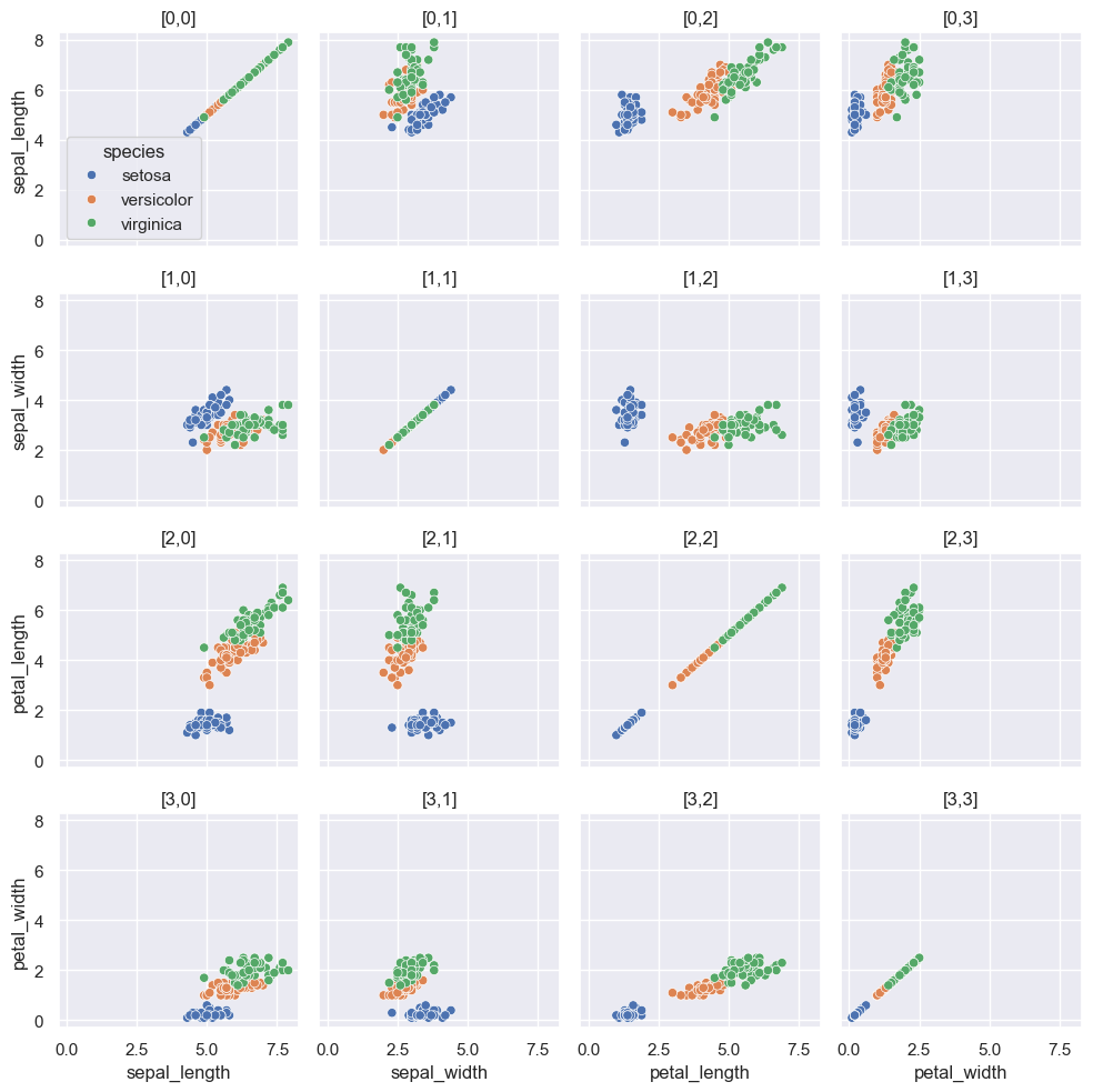
Matrix plot
# create a grid using plt.subplots
fig, ax = plt.subplots(4,4,figsize=(10,10),sharex=True, sharey=True)

# generate matrix plot(pairplot in seaborn)
for row, col_y in enumerate(df.columns[0:4]):
    for col, col_x in enumerate(df.columns[0:4]):
        # generate legend at [0,0] plot
        if row==0 and col==0:
            sns.scatterplot(ax=ax[row,col], data=df, x=col_x, y=col_y, hue='species')
        else:
            sns.scatterplot(ax=ax[row,col], data=df, x=col_x, y=col_y, hue='species', legend=False)

        # optional location id
        ax[row,col].set_title(f"[{row},{col}]")
        # optional plot position and axis
        print(f"[{row},{col}]",f"x={col_x}", f"y={col_y}")

# adjust the padding between and around subplots.
plt.tight_layout()
plt.show()
[0,0] x=sepal_length y=sepal_length
[0,1] x=sepal_width y=sepal_length
[0,2] x=petal_length y=sepal_length
[0,3] x=petal_width y=sepal_length
[1,0] x=sepal_length y=sepal_width
[1,1] x=sepal_width y=sepal_width
[1,2] x=petal_length y=sepal_width
[1,3] x=petal_width y=sepal_width
[2,0] x=sepal_length y=petal_length
[2,1] x=sepal_width y=petal_length
[2,2] x=petal_length y=petal_length
[2,3] x=petal_width y=petal_length
[3,0] x=sepal_length y=petal_width
[3,1] x=sepal_width y=petal_width
[3,2] x=petal_length y=petal_width
[3,3] x=petal_width y=petal_width
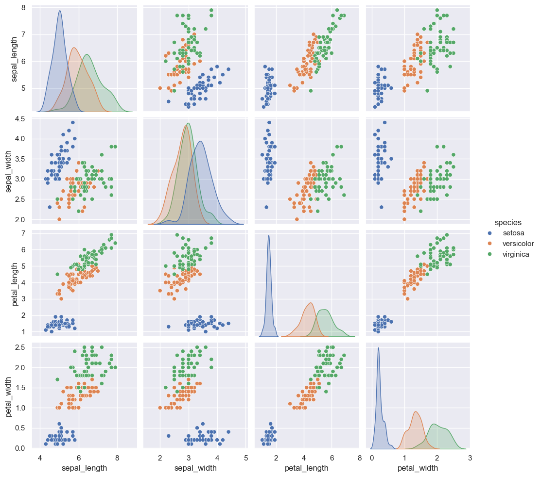
sns.pairplot(data=df, hue='species')
plt.show()
Color palettes
There are two ways to set color palette.
# set theme - default color palette is 'deep'
sns.set_theme(context='paper', style='white', palette='Set3', color_codes=True, font='century gothic')

# set color palette
sns.set_palette(palette='pastel', n_colors=None, desat=None, color_codes=False)
Possible palette values include:
- Seaborn palette (‘deep’, ‘muted’, ‘bright’, ‘pastel’, ‘dark’, ‘colorblind’)
- Matplotlib colormap
- ‘husl’ or ‘hls’
color_codes: bool
- If
Trueandpaletteis a seaborn palette, remap the shorthand color codes (e.g. “b”, “g”, “r”, etc.) to the colors from this palette.
# set theme with color_code = False
sns.set_theme(palette='deep', color_codes=False)
# Current color palettes
current_palette = sns.color_palette()
sns.palplot(current_palette)
# single letter color codes stays
sns.palplot(['b', 'g', 'r', 'c', 'm', 'y', 'k', 'w'])


# set theme with color_code = True
sns.set_theme(palette='deep', color_codes=True)
# Current color palettes
current_palette = sns.color_palette()
sns.palplot(current_palette)
# single letter color codes remap
sns.palplot(['b', 'g', 'r', 'c', 'm', 'y', 'k', 'w'])